
Project
NYU Skirball: Website Usability and Membership Redesign
Client
NYU Skirball Center for the Performing Arts
Timeline
6 week research and design sprint
My Role
UX Researcher and Designer
Tools
Figma, Userlytics, Private Panels
Making Support Simple: The NYU Skirball Membership Redesign
For NYU Skirball, the "What" was a confusing membership flow. But the "Why" was deeper: Users weren't just lost; they were unsure of the value proposition and the distinction between a donation and a membership.
At A Glance
The Problem:
Users couldn't tell the difference between memberships and donations, causing hesitation and drop-off.
What I Did: Moderated usability testing (8 users) + competitive analysis to watch confusion happen in real time.
What I Found: Users didn't need more options; they needed clearer guidance at decision points.
The Impact: Research recommendations were implemented on the live site, improving navigation and membership clarity.
The Setup

Timeline: 6-week research and design sprint (academic + client-facing)
This wasn't a blank slate project. NYU Skirball's website had evolved over time with limited documentation and inconsistent terminology. With 6 weeks and real constraints, My team focused on finding the most critical breakdowns and proposing changes that were actually achievable.
Why I Approached It This Way: The client requested targeted improvements to membership and donations, not a full redesign. I focused on the highest-impact changes within those constraints.
What was Actually Broken
Through testing, I saw users struggle with:
- Finding membership information in the first place
- Comparing membership tiers (too overwhelming)
- Understanding if this was a donation, subscription, or one-time thing
- Seeing membership benefits at the right moment
- Navigating in ways that felt natural to them.
These weren't just small pauses, they created real hesitation when users were being asked to commit.
Why This Mattered: When a site doesn't behave as expected, users lose trust. For an organization asking for financial commitment, these friction points weren't just annoying, they undermined credibility at the moment of decision.
My Research Approach
I led moderated usability testing with 8 new users to watch confusion unfold in real time. No personas, no journey maps— just direct observation of hesitation, rereading, and second-guessing.
I needed to understand why users struggled, not just where. Moderated testing let me probe confusion in real time and uncover mental models and emotional barriers that analytics can't show.

I focused on the moments where users paused or asked clarifying questions. Task completion didn't matter if people felt uncertain while doing it.

What I Discovered
During testing, users consistently struggled to locate membership information within the existing navigation. Many assumed it would live under “Explore” or “About,” while others interpreted “Donate” and “Membership” as the same thing. This structure created uncertainty early in the journey, before users even reached checkout.
Key Insights
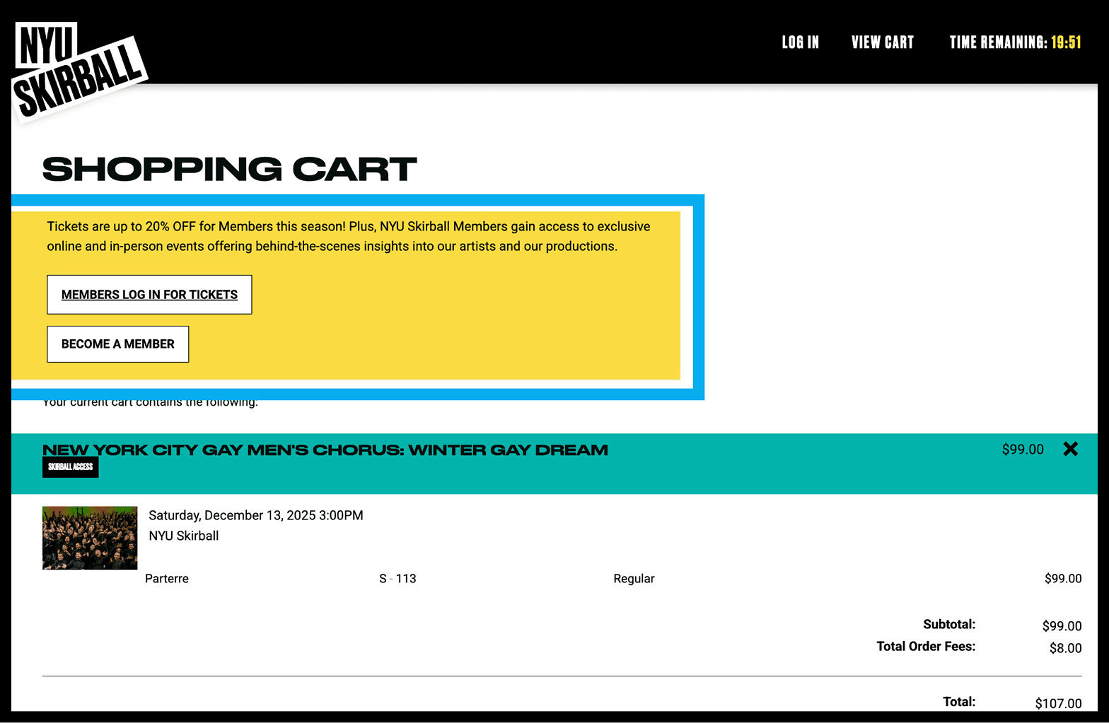
Insight 1: Membership vs. Donation Confusion
Users thought these were the same thing, especially during checkout.
Why This Happened:
Both options used similar language and visual treatment. Without clear differentiation, users assumed they were the same thing.
Insight 2: Navigation Didn’t Match Expectations
Users expected "Membership" as its own thing. When it lived under "Donate," they missed it.
Why This Mattered:
Users expected to find 'Membership' where other cultural institutions put it. When they couldn't, they assumed Skirball didn't prioritize it, and left.
Insight 3: Cognitive Overload During Tier Comparison
Users struggled to quickly compare membership tiers and understand benefits. Without clear visual hierarchy or scannability, the information felt overwhelming and frustrating.
Why This Blocked Decisions:
Vague tier names and unclear benefits made users ask 'Which one is right for me?' When they couldn't answer quickly, they froze or abandoned.
Insight 4: Lack of Recovery Paths Reduced Confidence
When users felt locked into a choice without clear feedback, such as during seat selection or membership prompts, they disengaged or attempted to backtrack rather than move forward.
Why Recovery Matters:
When users feel trapped without a clear way to undo decisions, anxiety spikes. Confidence comes from feeling in control with visible exit routes, not just forward momentum
Together, these insights pointed to a larger pattern: users didn’t need more options, they needed clearer guidance at moments of choice.
Change 1: Membership Tiers Made Clearer
The Insight
Users couldn't quickly scan or complete tiers.
The Solution
Reorganized tiers with clearer categories and more descriptive language. Used patterns from competitor research.
Why This Approach:
A complete redesign would have violated client constraints and overwhelmed older users. We reorganized the language to resonate with the 65+ demographic, the target users for the site's membership and donation section.
Before

After

Change 2: Fixed Navigation to Match Expectations
The Insight:
Users expected "Membership" to be its own menu item.
The Solution:
Added "Membership" directly to main navigation, aligning with patterns across cultural institutions.
Why One Clear Page:
When something is important, it is important it has space to feel important. One comprehensive page with strategic reminders at checkout beats scattered information that forces users to remember or backtrack.

Change 3: Showed Value at Decision Points
The Insight:
Users needed to see membership value when deciding, not after.
The Solution:
Integrated brief explanations throughout checkout instead of isolating everything on one page.
Why Follow Conventions:
Familiarity breeds confidence. Competitive analysis showed me users expect "Membership" in top navigation—matching that pattern eliminates unnecessary cognitive load.
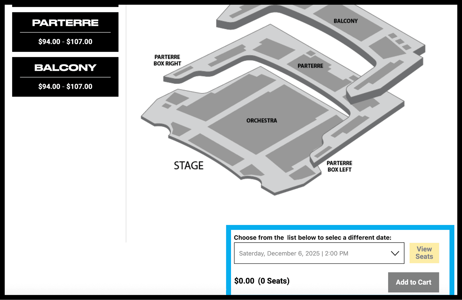
Change 4: Reducing Friction in Seat Selection
The Insight:
Users wanted to change seats for different dates, but couldn't find the option.
The Solution:
Repositioned the date to find seats available closer to the "Add to Cart."
Why This Small Change Mattered:
Grouping all seat selection controls in one predictable area stopped frantic page scanning. Users could focus on decisions, not hunting for options.
What I Did
- Sent screening tests and recruited 8 participants through private panels
- Led moderated usability testing sessions
- Observed and documented behavioral patterns
- Synthesized findings into themes using Figma
- Conducted competitive analysis
- Translated insights into design recommendations created on Figma
- Collaborated with team on final presentation to our clients.
Real-World Impact
All of these recommendations were implemented on the live NYU Skirball website during the project!
What Changed:
- Users could now find and understand membership options more easily
- Confusion between membership and donation decreased
- Checkout felt more transparent and forgiving
- Seating selection increased in ease of use
- The client responded positively to the feasibility of changes
What I Learned:
Good design isn't about aesthetics, it's about clarity. The most impactful changes weren't visually dramatic; they were the ones that removed friction and built confidence.
What This Taught Me:
That strong UX work often comes down to making thoughtful decisions under imperfect conditions. I learned to treat hesitation as useful feedback and focus on small changes that meaningfully improve clarity. When people understand what they're being asked to do, confidence follows naturally.
If I Took This Further:
- I would test with more users to validate patterns
- Track conversion and drop-off rates over time
- Conduct accessibility-focused testing
- Explore visual ways to show how membership supports Skirball