
Class Project
INFO 643: Information Architecture
Client
N/A
Timeline
6 week research and design sprint
My Role
UX Researcher and Designer
Tools
Figma, Userlytics, Private Panels
From Recipes to Relationships: Re-Humanizing Allrecipes
For Allrecipes, the “what” was a navigation system that had grown cluttered and difficult to scan. But the “why” was more human. People weren’t just getting lost, they were second-guessing themselves. The structure didn’t reflect how users naturally think about food, introducing hesitation at moments where confidence matters most. I focused this sprint on understanding how people approach cooking decisions before redesigning the site’s information architecture.
At a Glance
The Problem:
Allrecipes' navigation had grown cluttered over the years with nine overlapping categories. Users second-guessed themselves and couldn't find recipes with confidence.
What I Did:
Card sorting → tree testing → usability testing with low-fi prototypes to rebuild the information architecture around how people actually think about food.
What I Found:
Users approach food through different mental models (dietary needs, meal types, skill level). Too many similar options created hesitation instead of clarity.
Impact:
Simplified navigation from 9 categories to 3 clear groupings. Made community features visible and accessible. Helped users feel like active cooks, not just readers.
The Setup
Timeline: 12-week research and design sprint (academic)
With a 12-week sprint, we focused on navigation and the homepage, where hesitation showed up most clearly. We worked within Allrecipes' existing design system, making small structural adjustments rather than starting from scratch.
Without direct access to Allrecipes users, we recruited participants with similar cooking behaviors and needs using a wide range of methods.
Why We Focused On IA:
Information architecture was the right leverage point because navigation confusion was creating friction at every step of the user journey. Before improving visual design or adding features, we needed to ensure users could confidently find what they were looking for. A clear structure would amplify the value of everything else on the platform.
My Research Approach
I used three complementary methods to understand how users mentally organize recipes and what helps them feel confident: Card Sorting, Tree Testing, and Usability Testing.
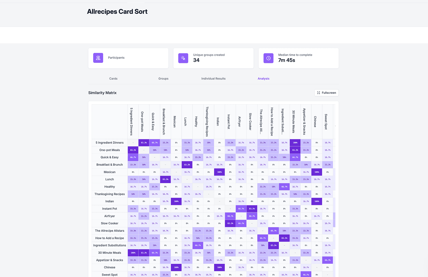
Card Sorting:
To understand how users naturally group recipe content
Why Card Sorting:
Card sorting reveals the mental models users bring to a task without imposing our assumptions. By letting participants create their own categories and labels, we could see how they naturally organize recipe-related concepts—patterns that might conflict with the current navigation structure.
We used an open card sort to let participants group recipe content without predefined labels guiding their choices.

Tree Testing:
We conducted a Tree Test to determine whether simplified structure improved task completion and confidence
Why Tree Testing:
After card sorting revealed how users think, we needed to validate whether our proposed navigation structure actually helped them complete tasks. Tree testing isolates the information architecture from visual design, letting us focus purely on whether the structure makes sense.
We tested whether a simplified structure helped users complete realistic tasks with more confidence.
What Tree Testing Showed:
Users completed tasks faster and with greater confidence when presented with 3 clear categories instead of 9 overlapping ones. The biggest improvement was in browsing behavior; users no longer paused to compare similar options. Users still struggled with tasks related to community features, confirming they needed more prominent placement.
Usability Testing:
We tested low-fidelity prototypes on participants to validate early structural decisions
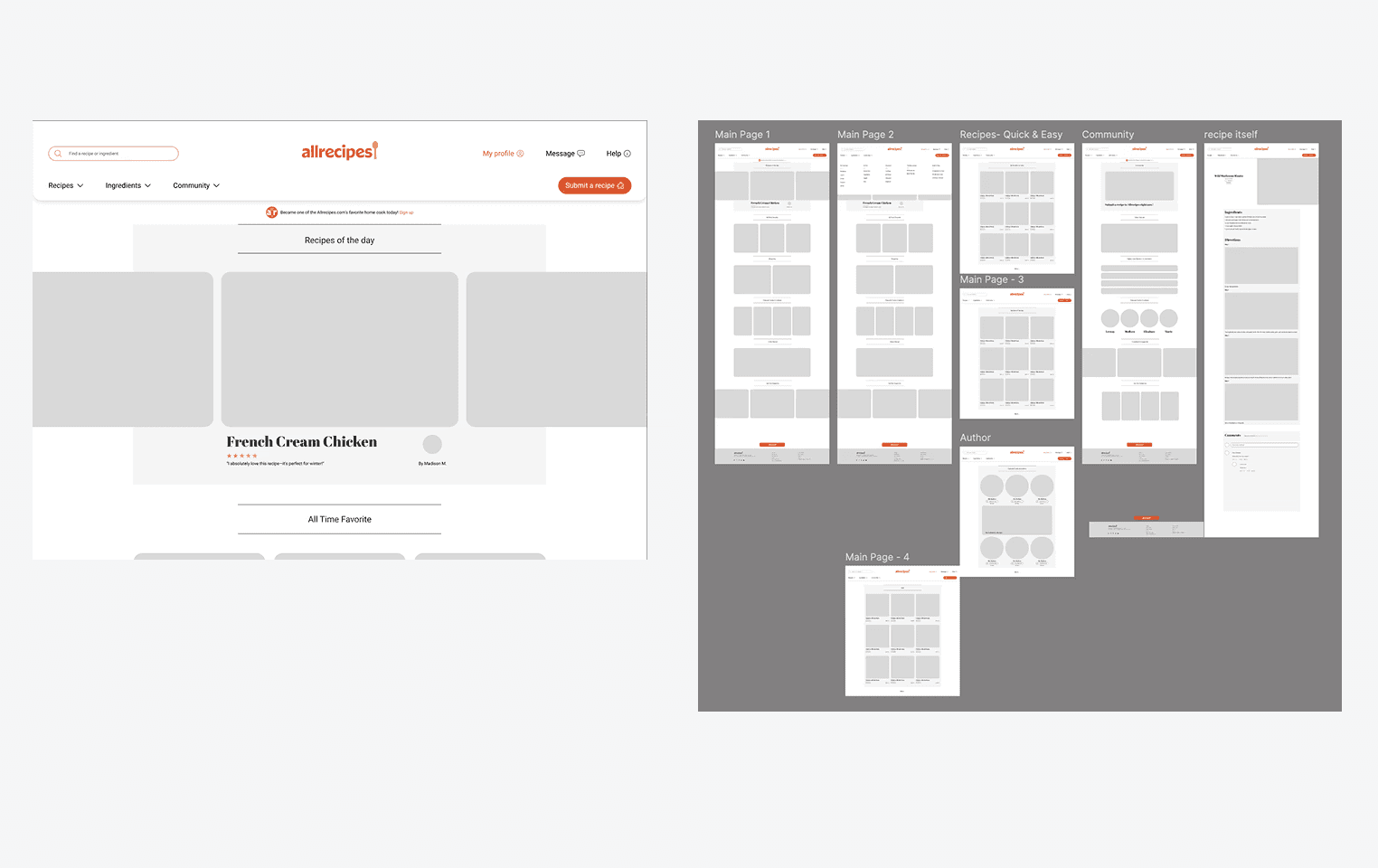
Why Low-Fidelity Prototypes:
After card sorting and tree testing, we paused to absorb feedback, adjusted our approach, and then tested with low-fi prototypes. It was like a test run with the information we had from card sorting and tree testing.
This Low-fidelity prototype focused on structure and functionality rather than aesthetics. At this stage, we wanted to validate that our navigation decisions solved the core problems without the distraction of colors, imagery, or polished interactions that would come later.
Key Testing Insights
Across all research methods, four patterns consistently emerged:
Insight 1: People approach food through different entry points
People approach food through different entry points
Some users think in terms of dietary needs (vegan, gluten-free), others by meal type (breakfast, dinner), and others by skill level (quick, beginner-friendly).
Why This Matters:
This insight revealed that Allrecipes' single navigation hierarchy forced users into one way of thinking. By creating multiple pathways to the same content—organized by diet, meal type, and occasion, we could accommodate different mental models simultaneously.
Insight 2: Too many choices increase hesitation
Nine navigation options with overlapping meanings (like "Meals," "Courses," "Dish Types") made users second-guess which category would have what they need.
Why This Creates Friction:
In usability testing, we observed users hovering between categories, reading and re-reading labels, and often choosing incorrectly on their first attempt. This hesitation interrupted the natural flow from "I want to cook" to "I found a recipe." Each unnecessary decision point eroded confidence
Insight 3: Clear parent categories reduce second-guessing
When categories had distinct, meaningful labels, users moved with confidence instead of comparing similar options.
Why Clarity Builds Confidence:
Clear distinctions reduce cognitive load. When users can immediately understand what each category contains without comparing it to others, they make faster decisions and trust those decisions more. This psychological shift from hesitation to confidence changes the entire cooking experience.
Insight 4: Community works best when it is visible and intentional
Users often missed community features because they were buried under vague labels. When visible, users felt encouraged to participate.
Why Visibility Drives Participation:
People engage with community features when they're presented as intentional, valued parts of the experience—not afterthoughts. By creating a dedicated Community Hub and surfacing "Submit a Recipe" prominently, we signaled that user contributions matter, transforming passive readers into active participants.
Design Decisions
Each decision below came directly from what users showed us in testing:
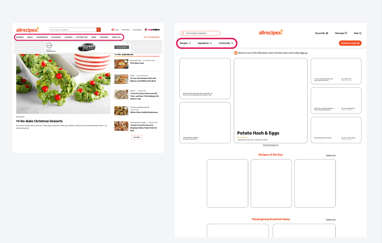
Change 1: Simplified Navigation from 9 to 3 categories
The Insight:
Users hesitated when comparing similar navigation labels.
The Solution:
Reduced from 9 overlapping options to 3 clear groupings based on how users naturally think about recipes
Why These 3 Categories:
Card sorting data showed users naturally grouped content into three distinct mental buckets: how they want to browse (by cuisine, diet, occasion), what they want to discover (trending, seasonal, recommended), and how they want to engage (community, submit recipes). These three categories honored different user motivations without overlap.
Change 2: Made Community Visible and Accessible
The Insight:
Community features were buried under labels users didn't associate with engagement (like "More").
The Solution:
Created a Community Hub with dropdown navigation and brought "Submit a Recipe" into main navigation.
Why a Dedicated Hub:
Centralizing community features signals their importance. Instead of scattering user contributions across the site, a dedicated hub creates a destination, a place where participation feels intentional and valued rather than incidental.

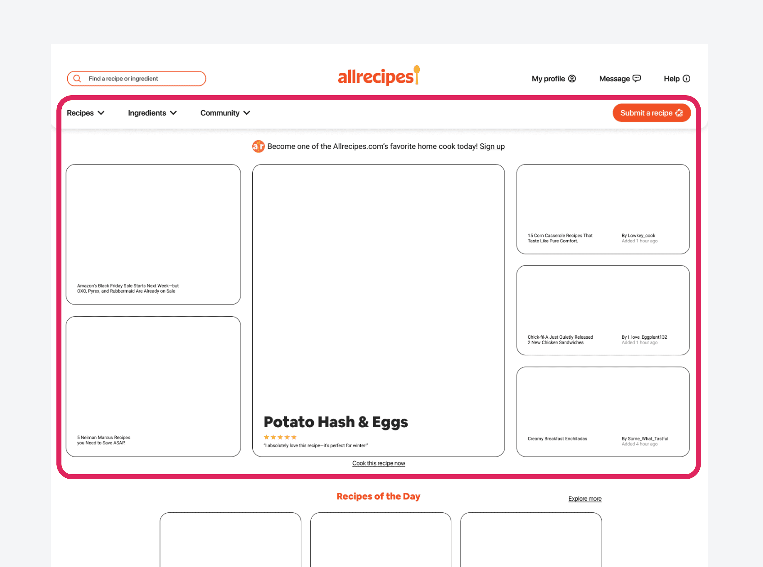
Change 3: Put Recipes First on Homepage
The Insight:
The original homepage featured blog articles. Users come to allrecipes to cook, not read blog posts.
The Solution:
I shifted the homepage focus to recommended recipes. This also featured creators to build trust and community.
Why Recipes Over Articles:
Competitive analysis of similar platforms showed that users engage most with recipe content, not blog articles. Leading with recipes honors user intent and gets people cooking faster. Articles can exist, but they shouldn't be the primary entry point.
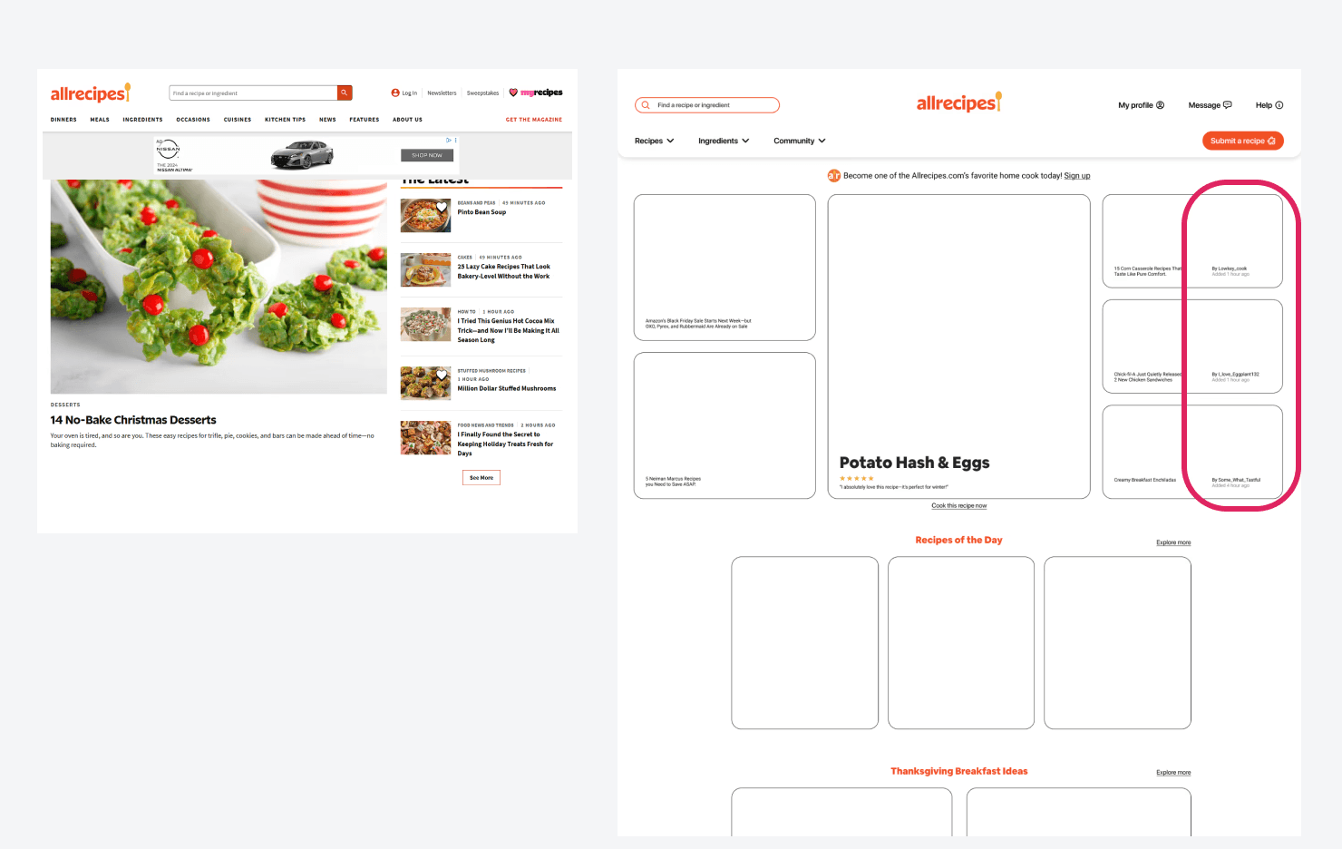
Change 4: Made Creators Visible Throughout
The Insight:
Users trust recipes more when they know who created them
The Solution:
Featured creator names and photos prominently on recipe cards and pages.
Why Creator Visibility:
Having creator visible instills trust and connection with users. People know who they are instantly getting a recipe from.
What This Taught Me
Working with a smaller research sample means accepting you're only seeing part of a larger picture. Every person brings different habits, emotions, and expectations to cooking.
What this process offered was clarity. By watching where people paused, hesitated, or felt confident, we designed around real moments, not assumptions. These patterns guided us towards thoughtful decisions while leaving room for variation and future learning.
The outcome reflects an honest response to what we observed:
not a final truth, but a respectful step toward meeting people where they are.